Pola Engineering
GEARS / 项目

Pola Engineering

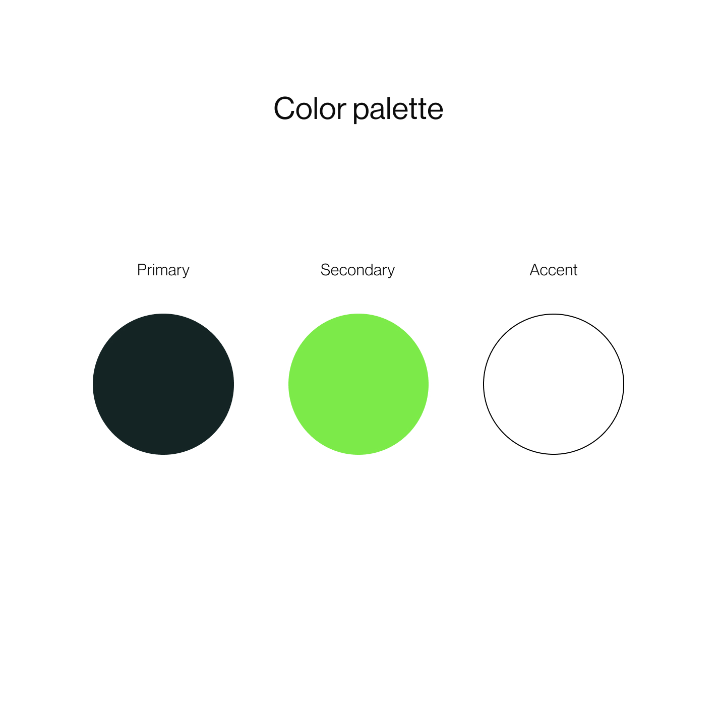
The Pola Engineering project involved comprehensive branding and the implementation of a website for a company specializing in quality control, repairs, and production support. The color scheme is based on deep sea green, fresh green, and white, reflecting the professionalism and reliability of the company. The website was designed with functionality in mind, offering easy access to services and showcasing the company's competencies.

Brand identity12/2020
GEARS / 项目细节

项目详情

范围
branding, logo, webdesign, webdevelopment
客户
Pola
日期
12/2020
国家
poland
观看现场项目 ↗
GEARS / 案例研究Pola Engineering

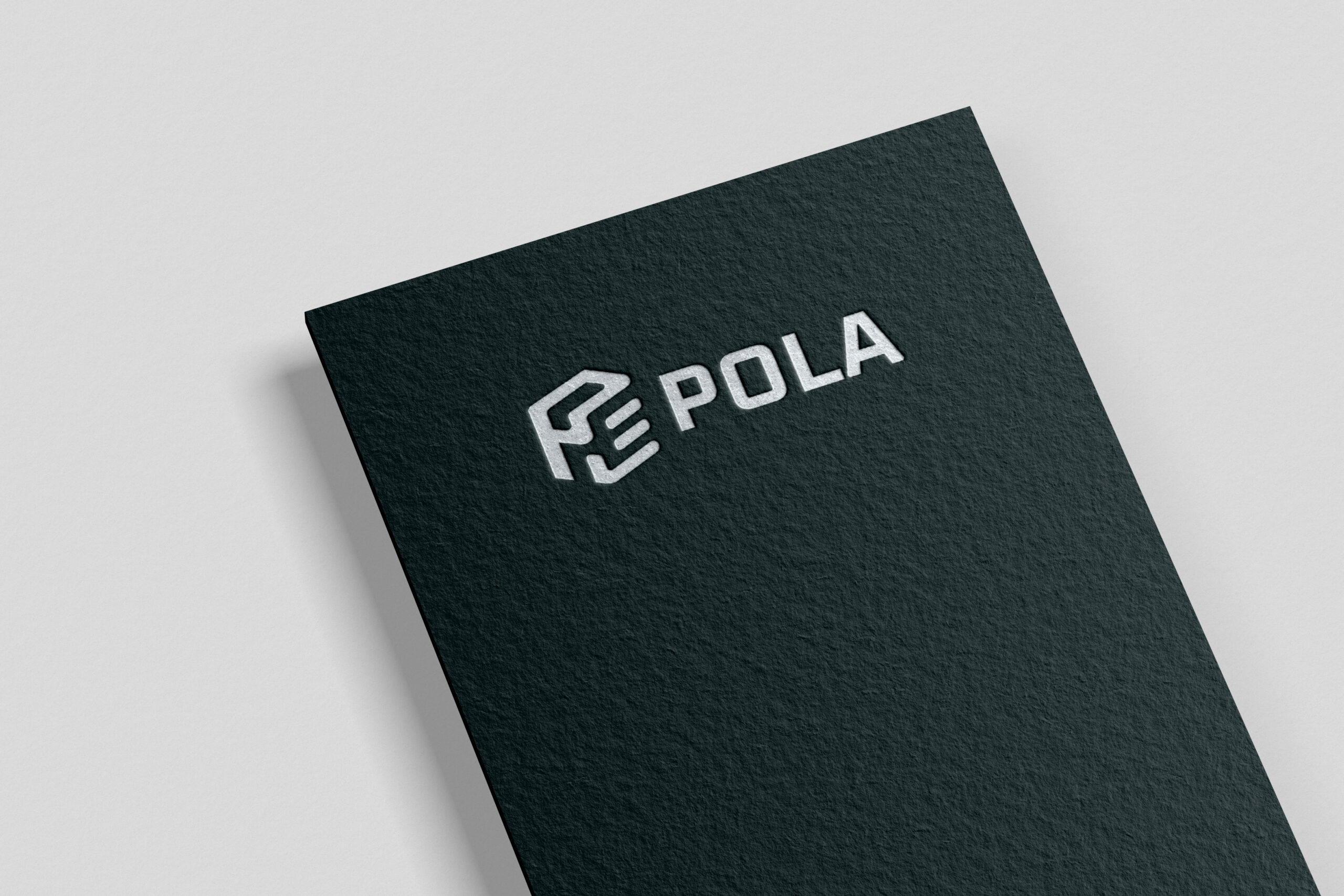
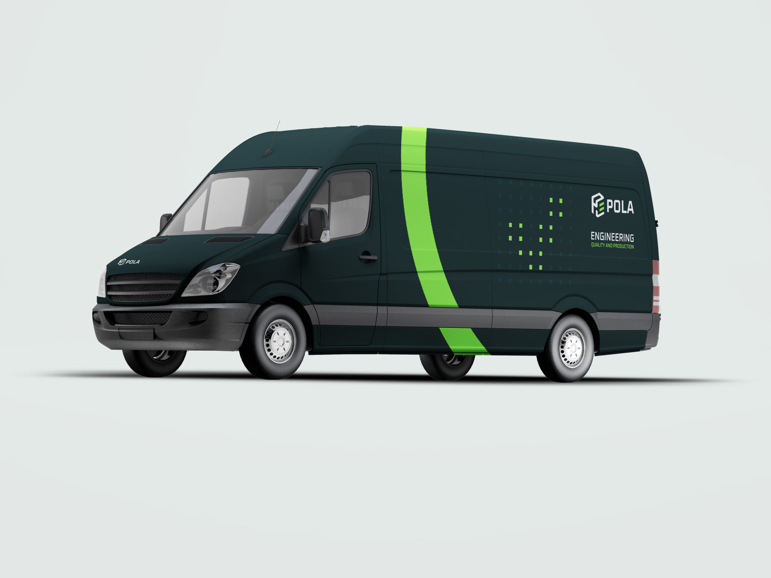
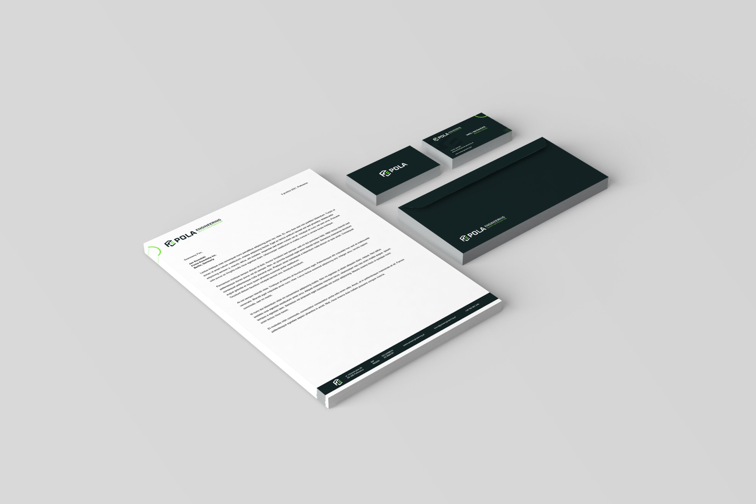
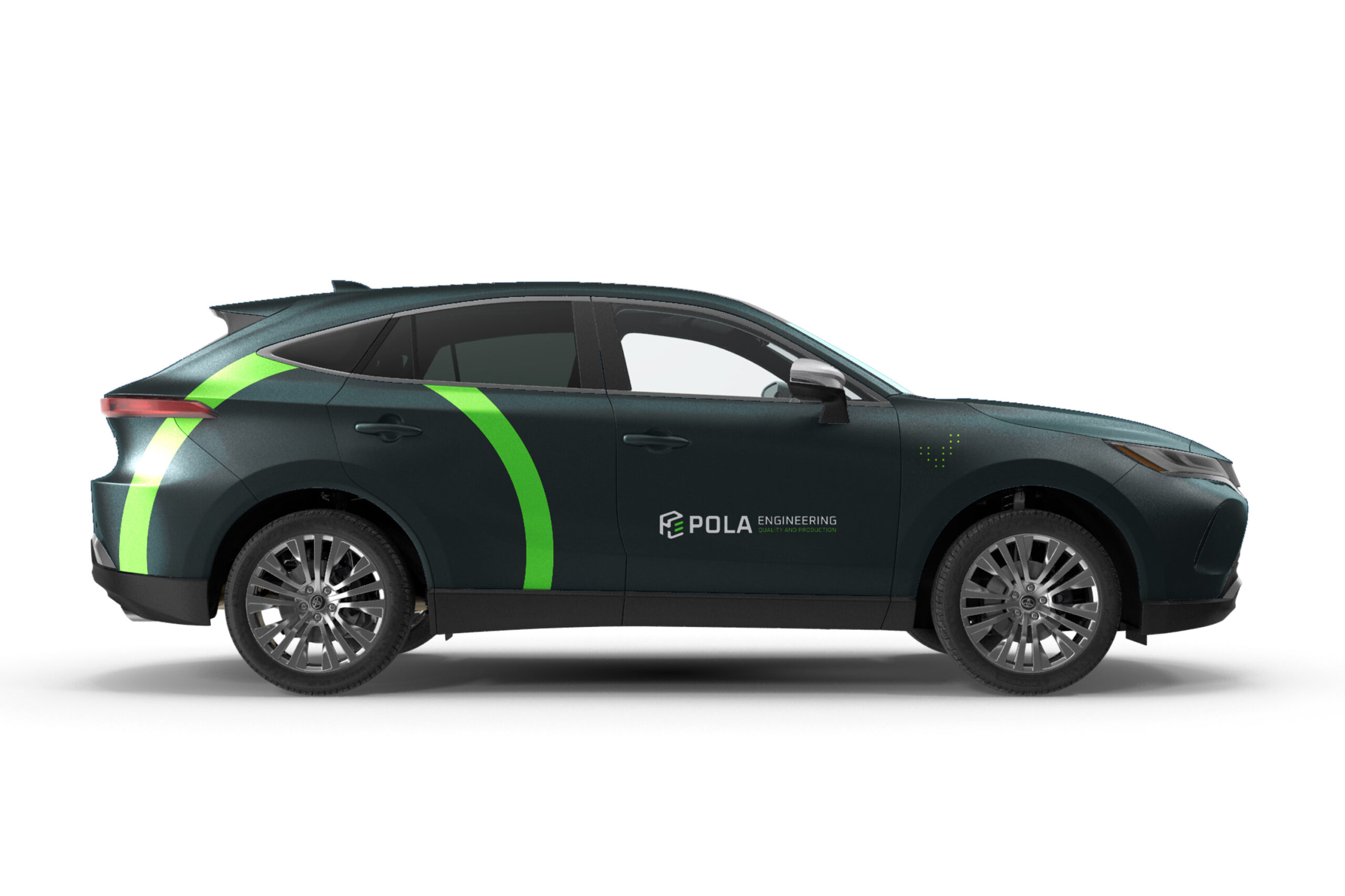
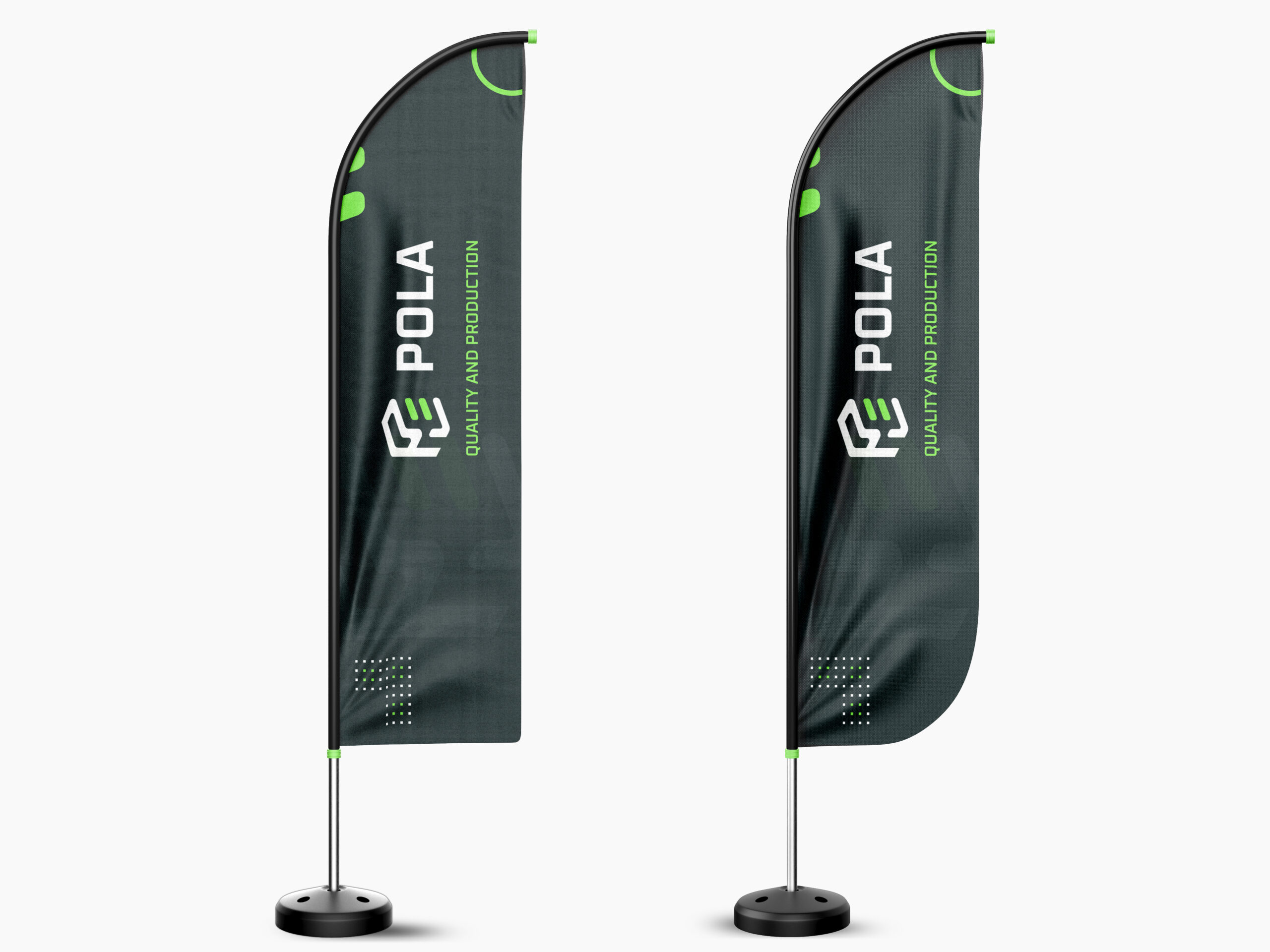
Logo Pola Engineering effectively combines the letters "P" and "E" with an additional "tick" symbol, representing the precision and successful execution of work. The color palette, consisting of deep sea green, fresh green, and white, not only emphasizes the company's professionalism but also evokes trust and reliability. Graphic materials such as business cards and brochures were designed in line with these colors and principles, ensuring visual consistency across all branding elements. This thoughtful approach reinforces the brand's identity and creates a cohesive and reliable image for the company.

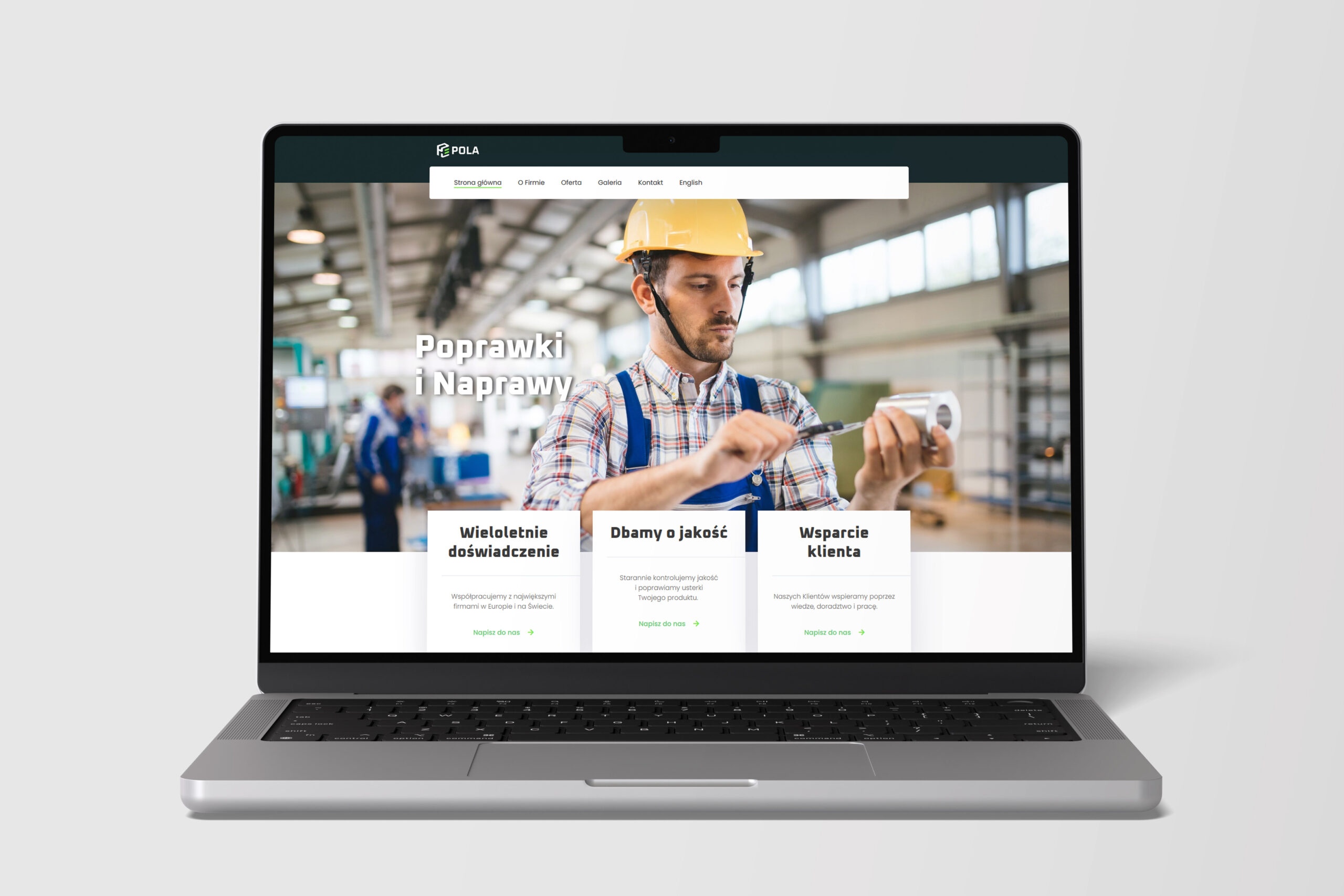
The Pola Engineering website has been designed with functionality in mind, offering users intuitive access to information about services such as quality control, repairs, and production support. The simple yet modern design of the site focuses on readability and clarity, enabling easy navigation and quick access to key information, while simultaneously strengthening the company's professional image in the industry.

GEARS / 接下来的移动

在工作中看到一些熟悉的东西吗?

我们可以从一个专注的对话,审计,或一个形状的项目简介开始。