Cliente
English
Iniciar un proyecto
Harrison & Sons
GEARS / PROJECT

Harrison & Sons

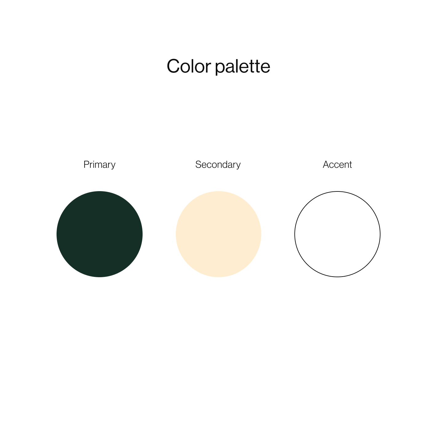
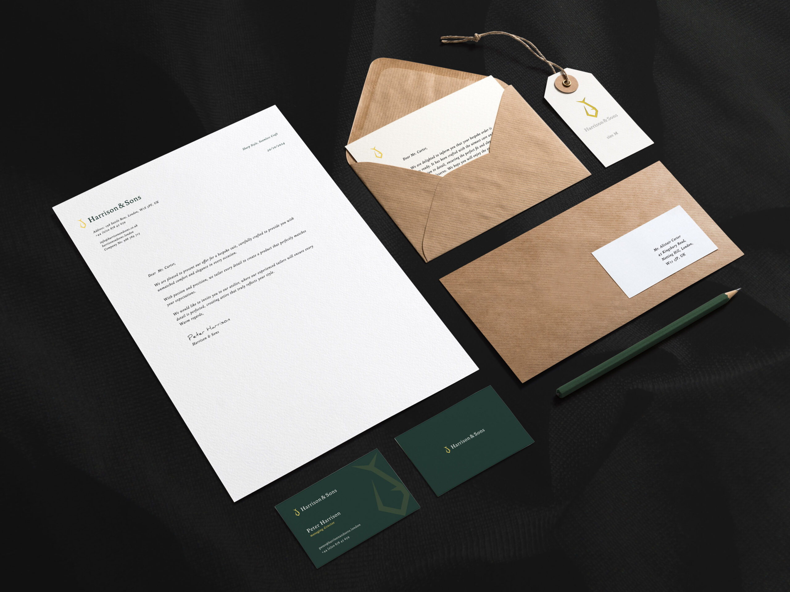
Harrison & Sons is a conceptual project for an exclusive tailor in London, combining classic elegance with distinctive symbolism. We created a unique logo featuring a tie resembling a fish — a symbol of precision, fluidity, and style. The color scheme, based on deep green, gold, and white, emphasizes the luxurious character of the brand. The design was created with the needs of discerning clients in mind, valuing a personalized approach and high quality.

Concept04/2025
GEARS / PROJECT DETAILS

Detalles del proyecto

Alcance
branding, logo, webdesign, support, ecommerce, webdevelopment
Cliente
Gears
Fecha
04/2025
País
uk
GEARS / CASE STUDYHarrison & Sons

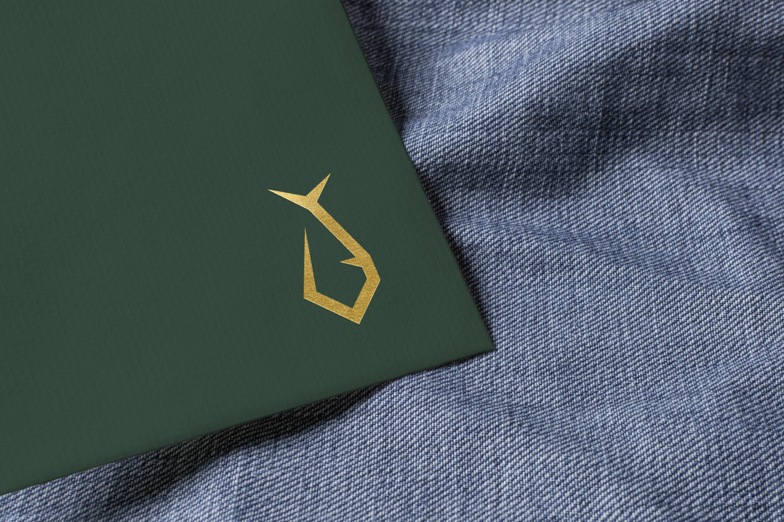
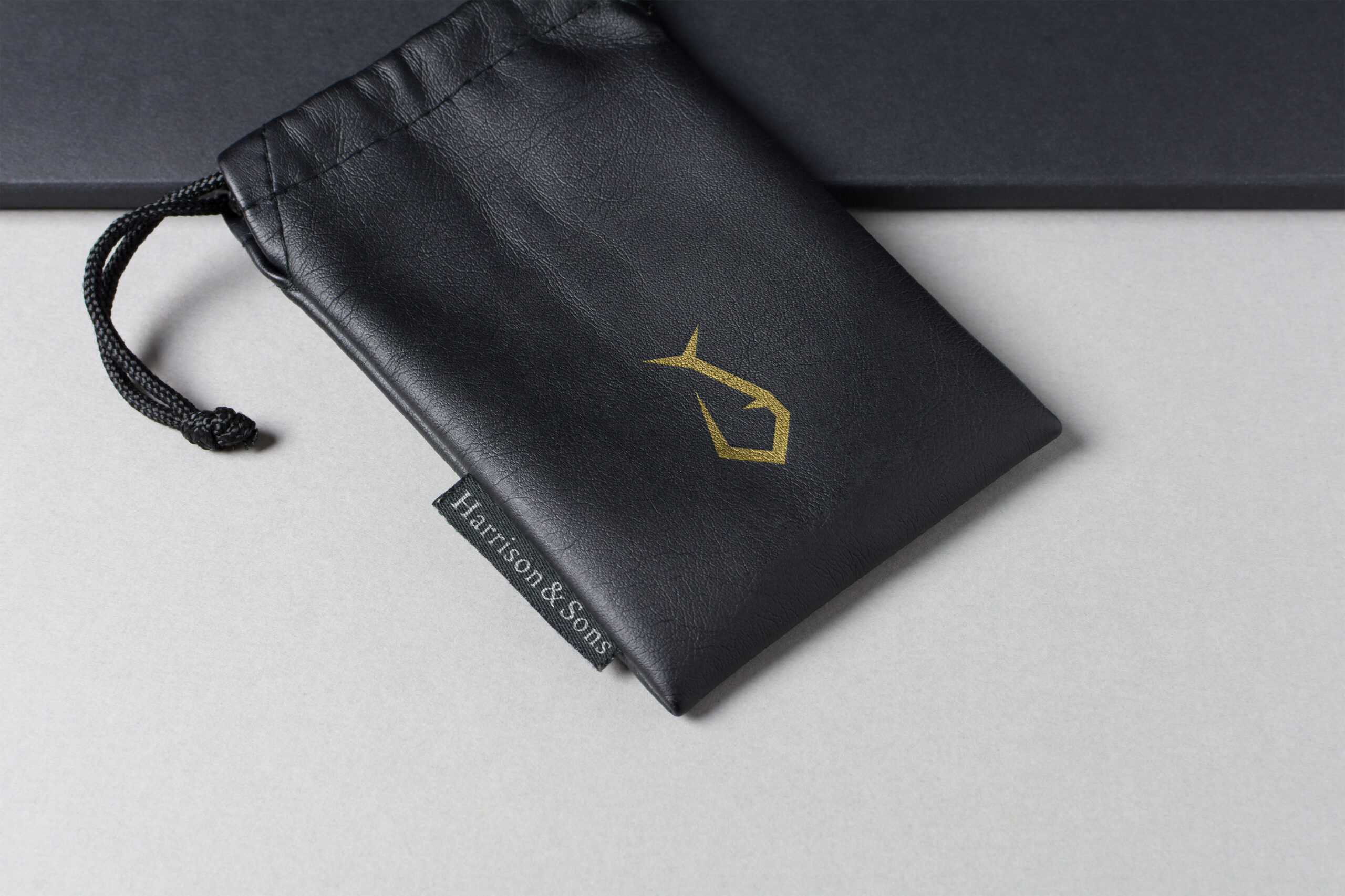
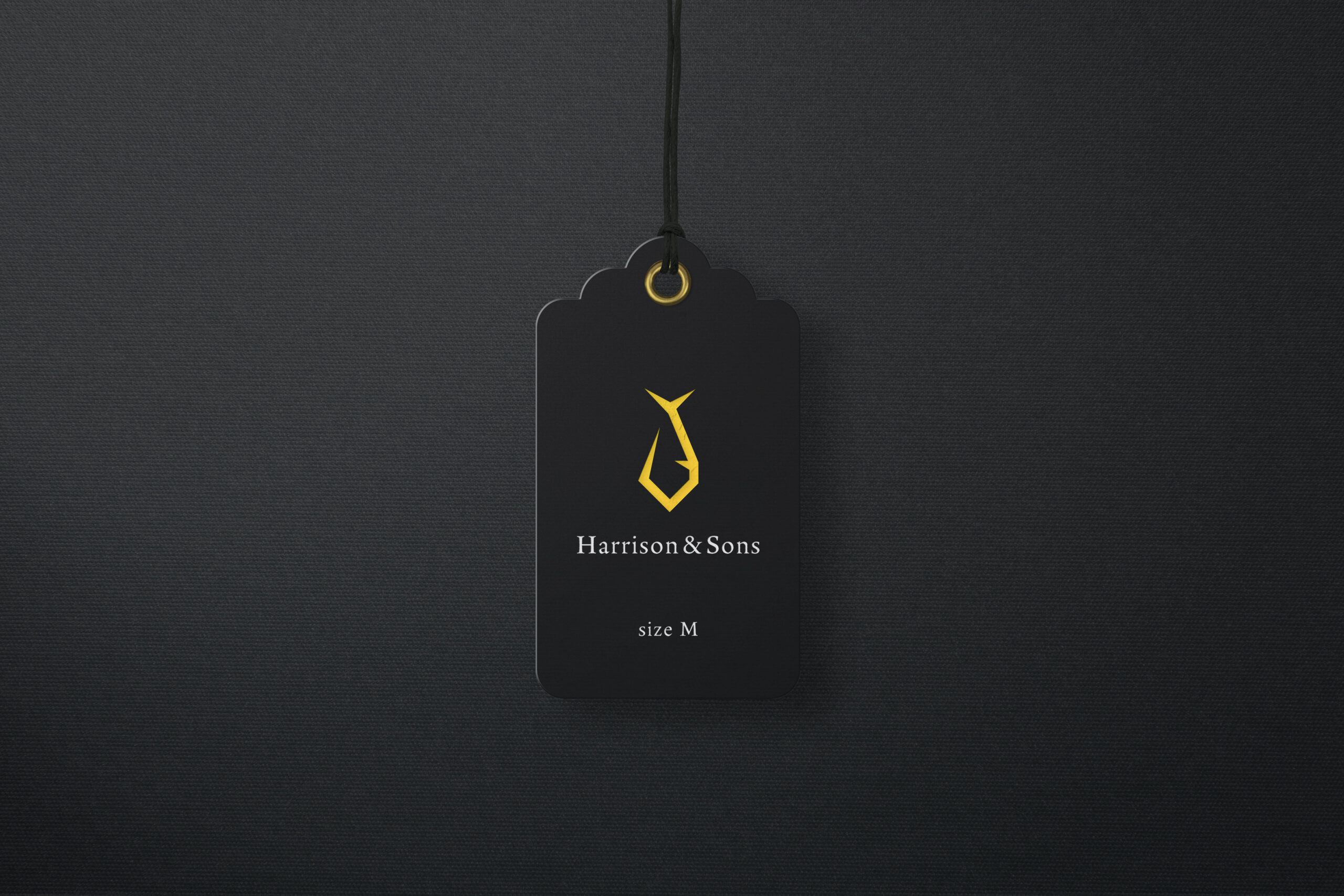
The Harrison & Sons logo has been designed to capture the essence of exclusivity and precise craftsmanship. The tie symbol, resembling a fish, serves as a striking metaphor for elegance while also alluding to the fluidity and finesse characteristic of a master tailor. The color scheme of the logo, with deep green as the backdrop combined with a golden accent, exudes luxury and refinement.

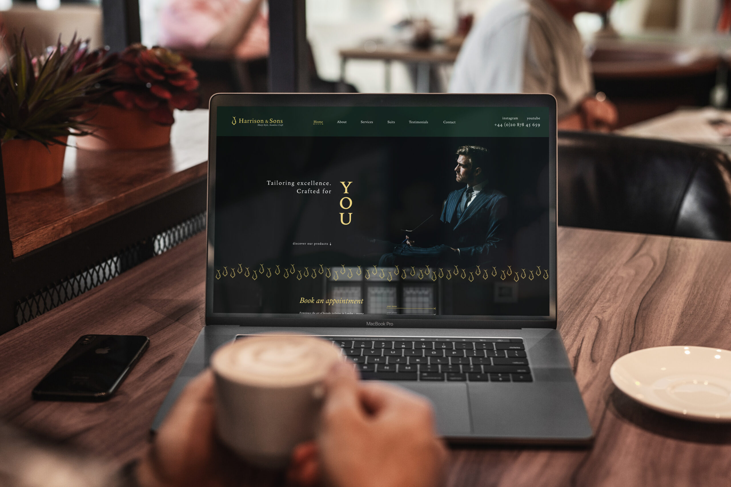
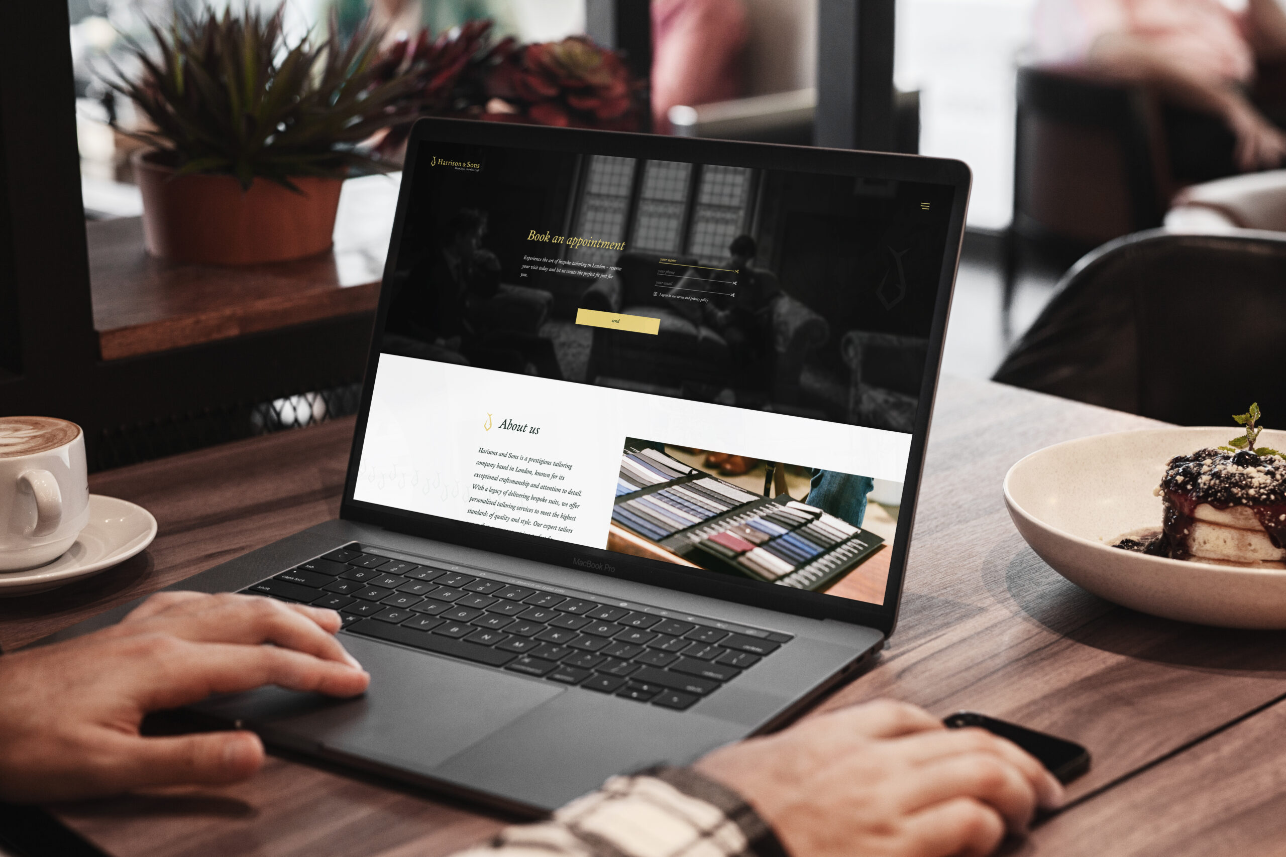
The Harrison & Sons website has been designed in a minimalist yet elegant style that perfectly reflects the brand's character. The use of space and subtle details, such as delicate gold accents, give the site a sense of lightness and sophistication. The booking system has been integrated intuitively, allowing clients to easily schedule appointments with the tailor.

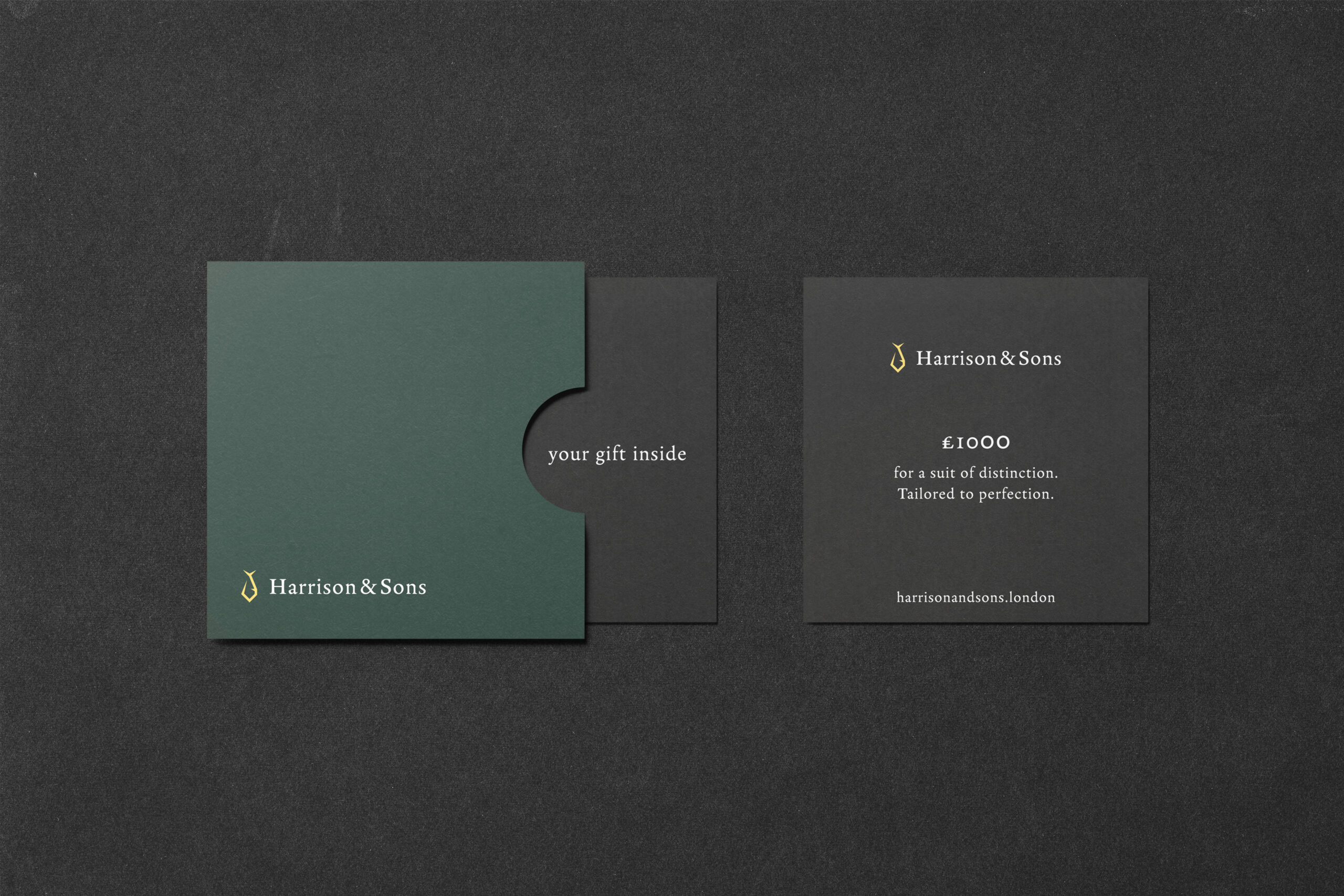
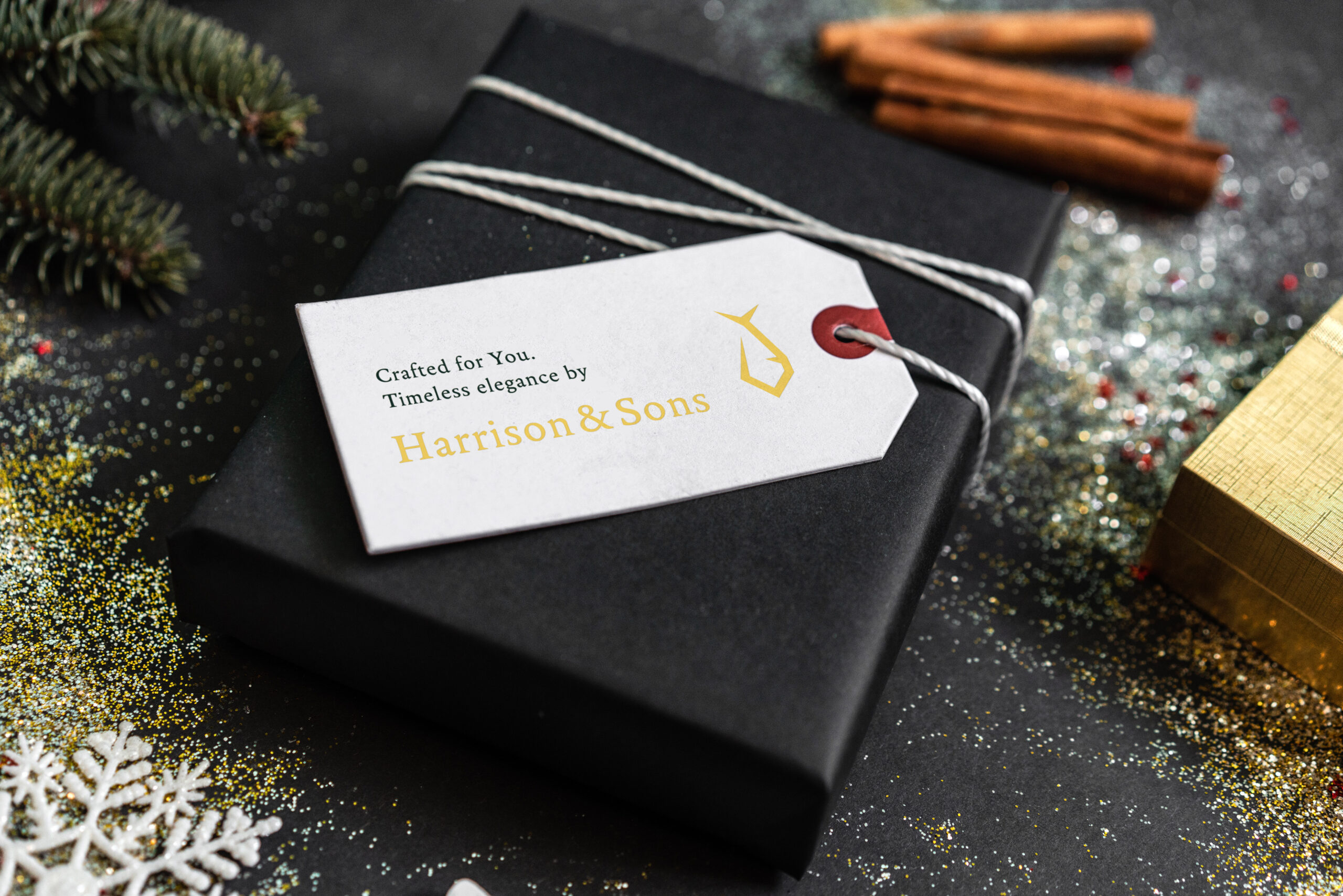
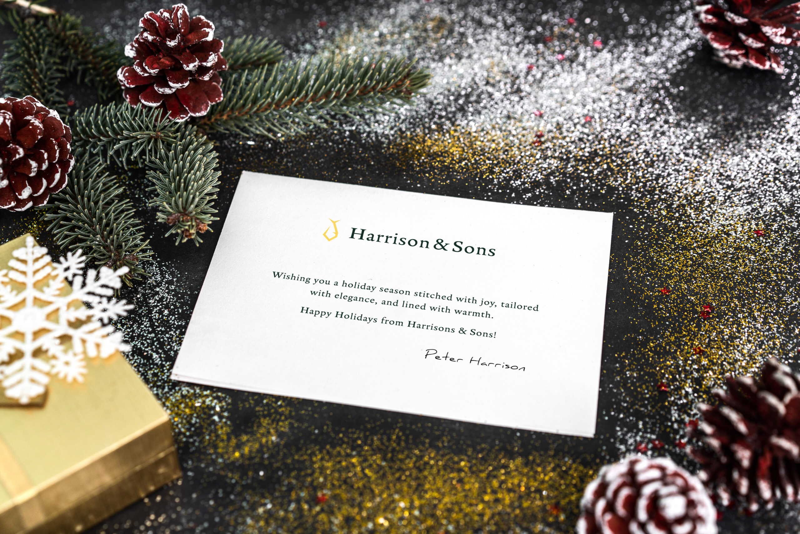
To emphasize the luxurious character of the Harrison & Sons brand, additional materials were created that perfectly complement the overall visual identity. Vouchers showcasing the exceptional tailoring services were designed with the intention of being elegantly presented in special envelopes. Every detail, from the paper to the style of the envelope, was carefully selected to highlight the exclusivity of the offering. This method of presenting accessories not only enhances the sense of luxury but also creates lasting memories for the client.

The label design for Harrison & Sons is another element that completes the brand's exclusive character. The label was designed in a minimalist style, using elements of the visual identity — deep black and golden accents. Placed on an elegant tag, the label not only informs about the highest quality materials and craftsmanship but also subtly expresses the brand's class and prestige. Every detail of the label aims to remind the client that they are wearing a product that combines tradition with modern style, tailored to individual needs.

GEARS / NEXT MOVE

See something familiar in the work?

Tell us what needs to move forward. We can start with a focused conversation, an audit, or a shaped project brief.